Graphic Design 1
Task 1
History Of Graphic Design
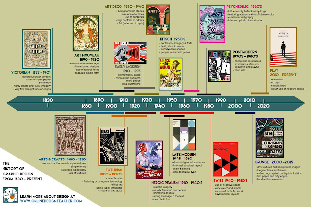
Graphics are visual statements committed to a surface, such as a wall , a canvas, pottery, a computer screen, paper, stone, even to the landscape itself. The term "graphics" relates to the creation of signs, charts, logo, graphs, drawings, line art, symbols, geometric designs and so on. Graphic design is the art of profession of combining text, pictures and ideas in advertisements, publications or websites. In its broadest definition, therefore, it refers to the whole history of art, although painting and other aspects of subject are more usually treated as art history.

Early Innovations in Visual Communication and Printing
15,000–10,000 BC: The first known visual communication, with pictographs and symbols in the Lascaux caves in southern France.

Revolutionary Changes to Typeface
1470: Nicolas Jenson, considered one of history’s greatest typeface designers, sets a new standard for the Roman type.

The Industrial Revolution
1760: The Industrial Revolution begins and sets the stage for advances in graphic design production.

Design Comes Into Its Own
1861: William Morris, who became a highly influential figure in design history, sets up his art decorating firm. He was a major player in the British Arts and Crafts Movement.

Modern Design Styles Emerge
1900: The Futurism style of design emerges. Influenced by cubism and technology, it dropped all the traditional features and concentrated on clean, sharp, straight lines. It was popular through the 1930s.
Styles Closely Follow Pop Culture
1932: The Times New Roman typeface is created by Stanley Morrison. It was commissioned by the "Times of London."
The Digital Revolution
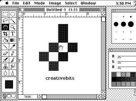
1990: The first version of Adobe Photoshop is released, creating a revolution in the way graphic designers work.

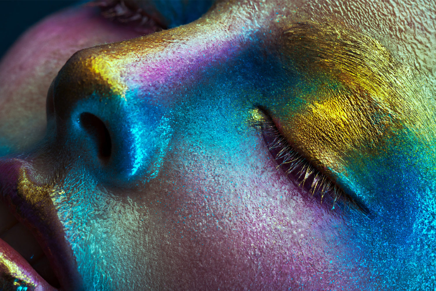
2017: Photography where one small movement is made, to grab viewers' attention in the clutter of on-screen marketing.

Historical Milestone And Typography

The development of typography started with the examination of ancient manuscripts. Sweynheim and Pannartz were the first printers in Italy and the two produced 12,000 editions of 37 different classical works.
About 30 years later Nicholas Jenson created the first definite break from black letter style. He craeted highly legible and even colored typeface based off of the formal humanistic scripts. In the 1500s, Francesco Griffo cut the first face based from chancery manuscript for the printer Aldus Manutius. This font was used to save space in bothe manuscript and print.

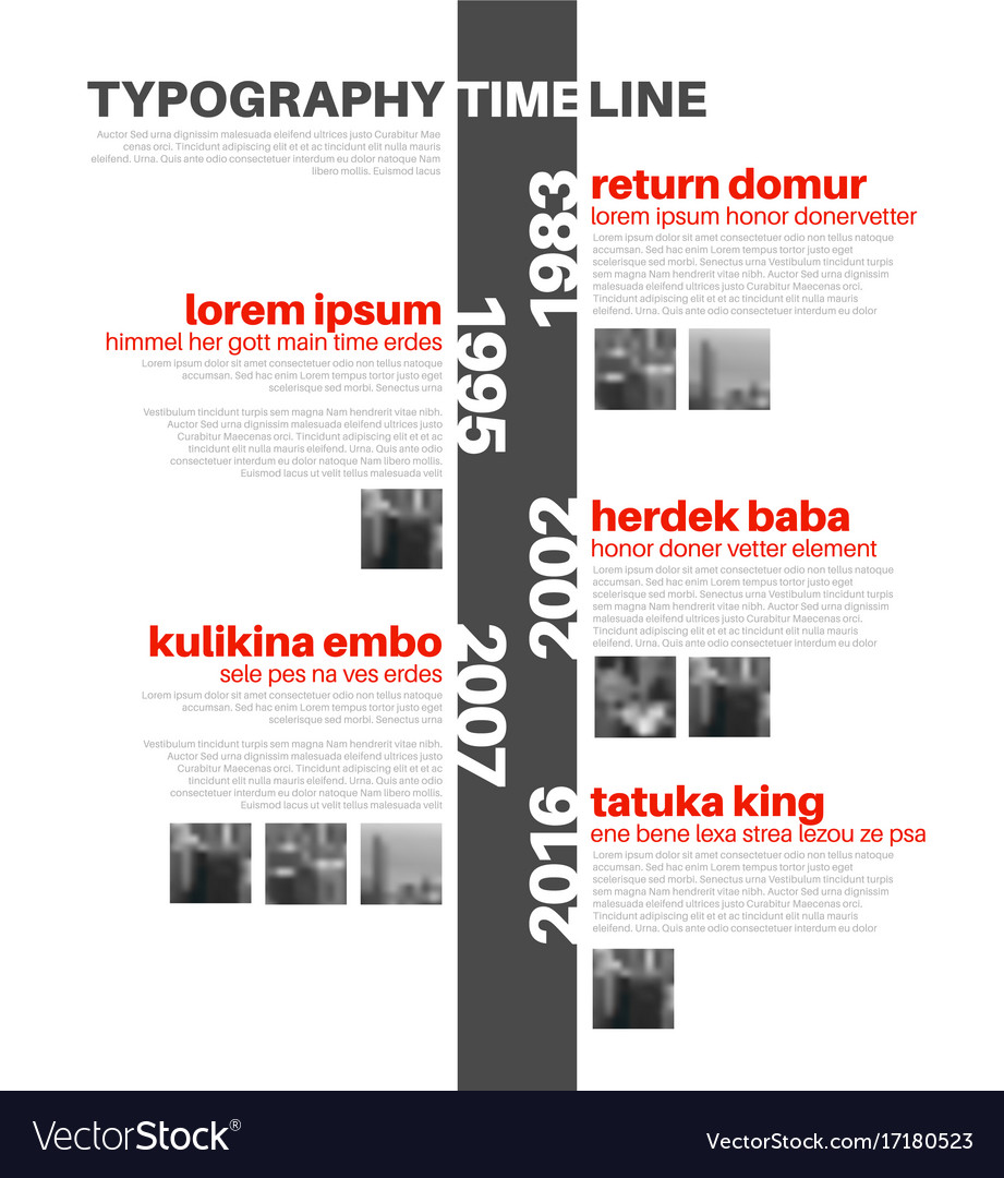
Typography is the art and technique of arranging type to make written language legible, readable and appealing when displayed. The arrangement of type involves selecting typefaces, point sizes, line lengths, line-spacing and letter-spacing and adjusting the space between pairs of letters, numbers and symbols created by the process.Typography also may be used as a decorative device, unrelated to communication information.
The Key Moments In the History Of Typography
Pi Sheng- Old Chinese "writing board"
The Phoenician Alphabet

Round year 1200 B.C., the phoenicians, being a nation made out of traders, need a way of a simpler visual representation, to manage better their activities.
The Greek Alphabet

Among with the adoption of the alphabet, the greeks adapted from phoenicians even the name of the letters. Thus, "aleph" became "alpha" , "beth" became "beta". Greeks also added to the alphabet other 5 vowels, which were missing in the phoenicians writing.
The Latin Alphabet

The Latin alphabet had in that moment 23 characters. Years after, it had been added the " U, W and J" letters.
ROLE OF A GRAPHIC DESIGNER
Logos - is a rhetorical device that includes any content in an argument that is meant to appeal to logic.
ROLE OF A GRAPHIC DESIGNER
Logos - is a rhetorical device that includes any content in an argument that is meant to appeal to logic.
Icons/Symbol - is a mark, sign or word that indicates or is understanding as representing an idea, object or relationship.Symbols allow people to go beyond what is known.

symbols
Icons
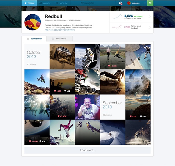
Websites - Websites come in a nearly endless variety,the pages within a website are usually a mix of text and other media.

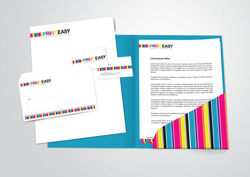
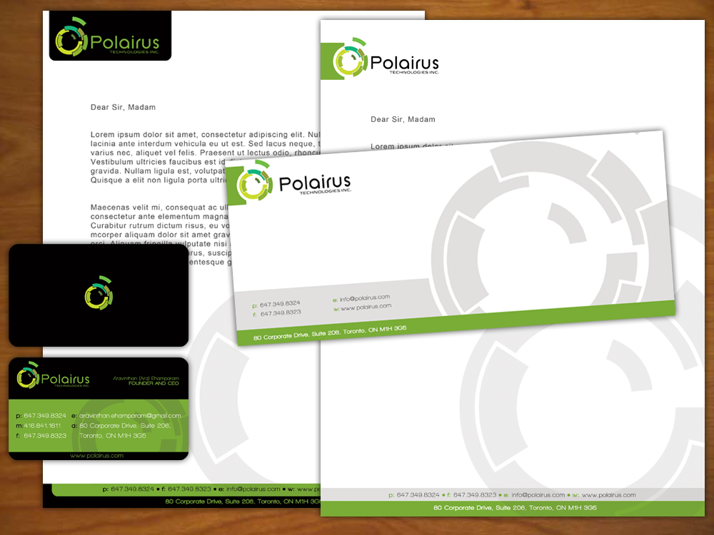
Corporate Stationery - is a common item branded by companies.Branding includes placing your brand name, logo, tagline and other symbols on notepads, business cards, letterhead and envelopes.

Letterhead

Call card

Envelope
Advertisements - Advertising is always present, though people may not be aware of it. It means of communication with the users of a product or service.

Book Designs - is the art of incorporating the content, style, format, design and sequence of the various components and elements of a book into a coherent unit.





Task 3-Logo


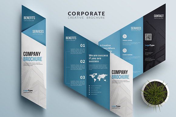
Brochures - is a common marketing tool used to advertise a service or product offering. It takes the form of a pamphlet or flyer that is used to distribute information about something.


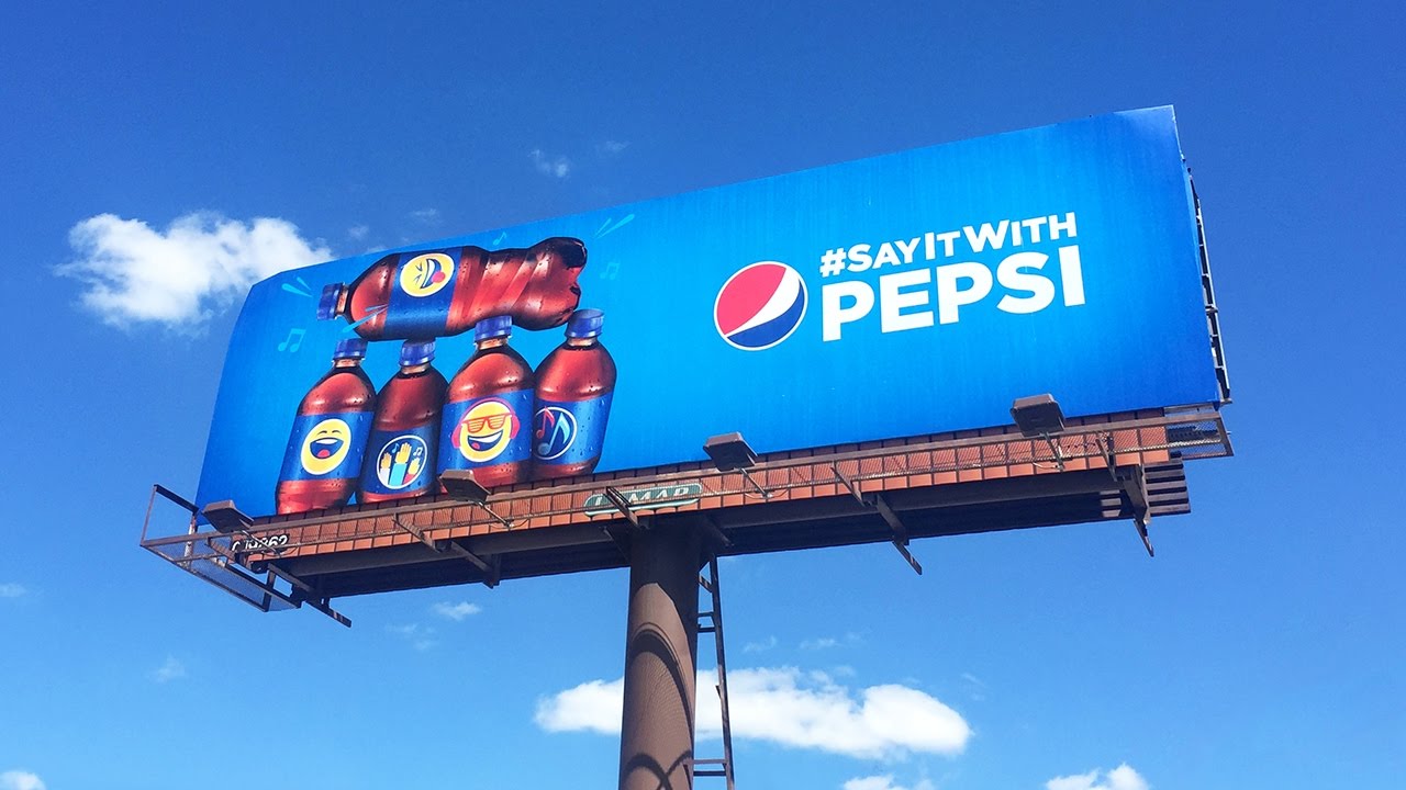
Billboards - is a large outdoor advertisement for which rent is charged according to where the amount of traffic that passes its location.


Product packaging - Most products have some form of packaging. Packaging serves a practical purpose of helping to store, handle, transport and display the product. It also involves bundling which is packaging related products together.


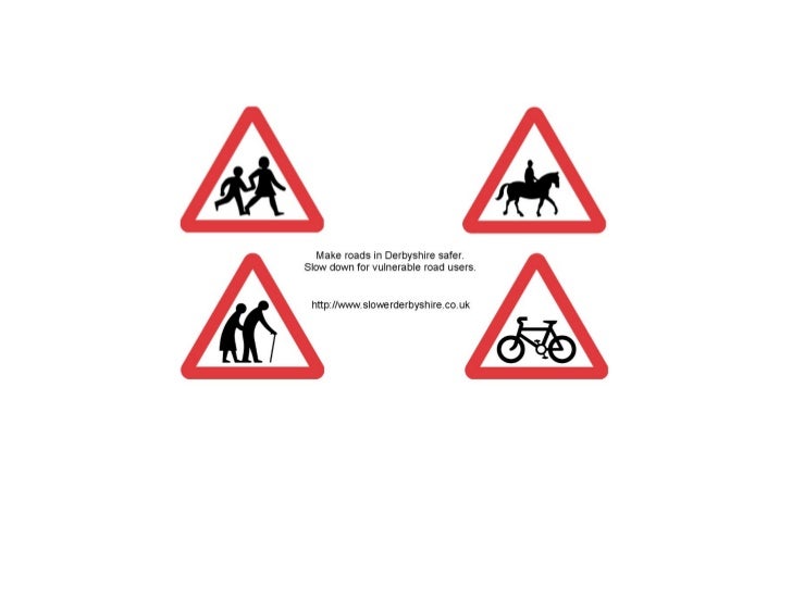
Posters - Posters is usually designed to be displayed vertically on a wall or window and is large enough to be seen. Its main target audience is the person walking by. A poster must convey its message with immediacy and purpose.

Reminding poster
Movie Poster

Road safety poster
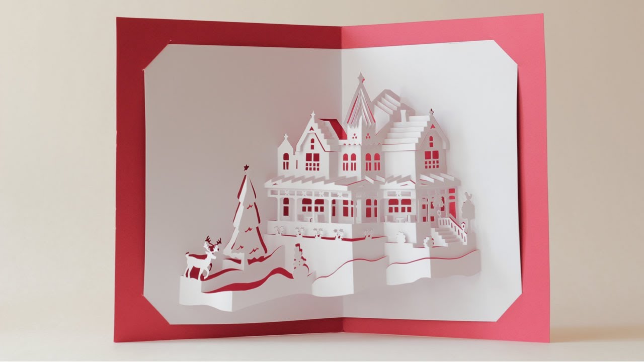
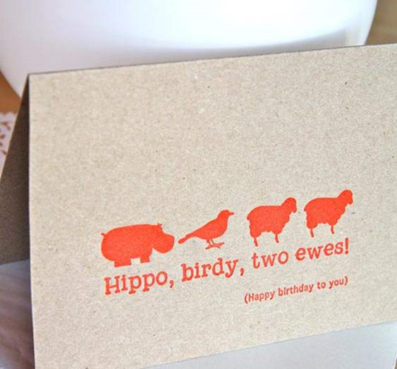
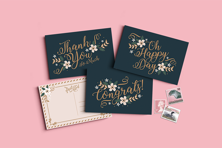
Greeting Cards - Greeting card is a decorative card sent to convey good wishes.


References
http://www.businessdictionary.com/definition/billboard.html
http://artsalive.ca/collections/posters/whatisaposter.php?lang=en
Task 2

Task 2
- The YouTube logo is creative.
- The first one features the word “You” printed in black while “tube” has been bounded by the red rectangle which distinguishes the first one.
- The use of the visible colors such as black, red and white shows the famous appeal of the company itself.
- The logo also catch people eyes from time to time.
- The shape of the rectangle is not really sharp but curve so that the logo can look be more pleasing to the eyes.
- The typo is used by sen-serif then the logo looked format contracted.
- The movement of the red rectangle is indicated for video play.

- The McDonald 's logo is striking and popular.
- The colour of the word "m" is bright so that protruding the logo while the background color can be set off by contrast.
- The red colour represents the food industry of this company,while the Golden colour represents the famous arches of its first franchised restaurant
- The McDonald’s logo is symbolic of the arches that were the substance of the newly-constructed architecture.
- The simplicity of the fonts that also make the name of McDonald’s look appealing to the eyes.
- The magazine cover is just like return to the ancients style.
- The photo is used black and white form to prominent the years drift by and period feel.
- The design roles a contracted style with the magazine cover,such as the underscore of the cover had some simple date and date font.
- Then, the straight line also makes the reader focus on the title.
- The font of typography is used by sen-serif.
- Colour assortments of the cover can let the title looks obviously clear and catch the readers' interest and catch their eyes.

- This brochure is very stylish and creative.
- The colour assortments of the brochure used by tertiary colours, bright colours will help to enhance this perception.
- The typo is attract attention with compelling text.
- The pentagon are very interesting and fashionable.

- The typography is considered handwriting category.
- Curcive lines.
- Colour assortments are mostly joyful and contrast.
- Festive,example New Year, Christmas , birthday, wedding,etc.
- The shape of greeting cards are no limited.
Task 3-Logo
BACKGROUND
Kentucky Fried Chicken restaurant is a widely popular fast food restaurant since the 1950s. People everywhere recognize the infamous Colonel Sanders founder of the Kentucky Fried Chicken restaurant logo a mile away.
From 1952 to 1978, the KFC logo had a very simplistic and unappealing design that was in black and white. Its logo was very bland looking and not very eye catching. It showed a serious expression of Colonel Sanders that was not friendly and did not emit warmth or welcome customers.
In 2007, the KFC logo into an appealing piece of art by bright colors and tight lines without having to use shading. The KFC logo entails a picture of Colonel himself smiling with a bright red chef apron and a red background. The name of the restaurant is shortened to the initials of Kentucky fried chicken into KFC in thick black text underneath the framed picture of the Colonel. The text uses a slightly modified form of the Friz Quandrata typeface. It has a simplistic appeal to consumers.
KFC started to grow and develop changing with the times and the demands of the costumers making them well known for their logo and delicious food. The Bright red color used in the logos brings a sense of warmth to the Colonels face which is inviting to consumers.
LOGO DETAIL AND DESCRIPTION
Belonging to one of the most renowned fast food restaurant chains in the world, the KFC logo has millions of fans. Over the course of its almost ninety years of existence, the company has gone through a few logos. However, the number of logos through which it went is strangely low compared to other similar restaurants. Additionally, KFC has always been praised for its impeccable timing and beautifully consistent visual identity.
The first incarnation of the KFC logo saw the light of day in 1952. It featured Colonel Harland Sanders’ head, sporting his typical bowtie, with the words Kentucky Fried Chicken to the left. This version of the logo appeared in 1952 and lasted until 1978. Being the face of the company, Colonel Sanders started being known throughout the country.
Next, the KFC logo went through a number of changes in 1978. The Kentucky Fried Chicken font was one of the biggest changes. Instead of the old hand script, the logo now sported a more professional, serif typeface. The Colonel’s face was also retouched, shortening the bow and streamlining the logo. This version lasted until 1991.
The third KFC logo came to life in 1991, and it started approaching the version we know today. This is the first instance of the logo featuring the color red, a color which would become their staple. It also started sporting blue, as designers changed the Colonel’s outline from black. The logo featured a series of progressively thicker red bars, with the letters KFC underneath.

Finally, the last version of the KFC logo until the 2006 redesign came to life in 1997. It featured the Colonel, still outlined in blue, on a red background. White is also a huge part of the logo, as it is featured as Colonel Sanders’ suit. This was the first time the Colonel was depicted as more than just his head. Three letters, KFC, complete the logo, appearing just below Sanders’ shoulder.
SELF BRANDING-LOGO
SELF BRANDING-LOGO
Sketches
Logo
Type Of Logo
Colour Testing
Logo Anatomy
MY Namecard Design
Envelope Design
Brochure Design
Logo Mood Board
Letterhead
File Holder
SELF BRANDING MOCK UP

:no_upscale()/cdn.vox-cdn.com/uploads/chorus_image/image/56414327/YTLogo_old_new_animation.0.gif)


Useful post
ReplyDeleteThank you for sharing this blog with us. Really appreciate your efforts for writing this blog and updating us with new updates.
Keep sharing more good stuff like this. Get information about UI / UX