Visual Communication
Visual
Communication
Prepared
for: Ms Nor Tijan Firdaus
Prepared By
: Evans Tiang Le Yee
Amos Walter
Goh
Shaw Kuang
Oscar Gan Chuan Song
Amanda Soimil
Weekly Task
Introduction
Even If
there is only one point, one mark on a blank page there is something built into
the brain that will meaning for it, and seek some kind of relationship or
relationship or order, if only to use it as a point of orientation in relation
to the outline of the page. If there are two point, immediately the eye will
make a connection and ‘’see’’ a line. If there are three point, it is
unavoidable to interpret then as triangle; the mind supplies the connection.
This compulsion to connect parts is described as grouping, or gestalt.
Eyes/mind
use to group points into meaning. There include Closure, in which the mind
supplies missing pieces to complete the image—this is occurs in the Mona Lisa
images to the right. A second concept is continuity—this describes the tendency
to ‘’connect the dots’’ and so accept separate parts or points as part of a
contour or form. It is hard to resist, for example, the compulsion to see two
dots as implying a line, or three as framing a triangle. Similarity describes
the tendency to see and group objects of similar shape or color. Proximity
result in a tendency to group points or objects that are close to one another
relative to less proximate in the visual field. Alignment, either along edges
of the objects or points or through their centers, will persuade us see them as
a contour or a line. For a further discussion of Gestalt theory and some visual
examples, go to this site.
Things get
more interesting when we add more than one dot and they interact with each
other. 2 dots near each other shift the emphasis of the relationships of the
dot with its surrounding space to the relationship and interaction between dot.
2 dots imply a structure. As the space between dots decreases the tension
between them increase. As that space approaches zero the tiny bit of space
itself becomes more important than either dot or any other interval of space on
the page. All the tension is held in that tiny bit of space.
As dots get
closer together they start to be seen as a single object. Their identity moves
to that of the single object instead of the multiple identities of distinct
objects. If we allow the dots to continue to get closer until one dot overlaps
the other, the tension in the space between them decreases, replaced by a new
tension based on the appearance of depth. One dot overlapping another creates a
figure/ground relationship. One dot is now in the foreground and the other is
pushed into the background. Overlapping dots form more complex shapes that
either of the individual dots. This resulting cluster of dots is in itself a
new dot with a different form.
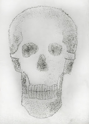
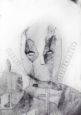
Point is
not a very expressive design element itself but used in multiples they can
either create order in a map or create warm, natural pattern in rendering. This
is great if designer wants to create a more hand-made feeling in their design.
Point can
used to create texture and shade at the same time in rendered images. Point
Impressionist French painter Georges Seurat was a pioneer of making pictures
out of dots paint. This detail from La Parade de Cirque 1887-89, shows the way
he worked in a style called ‘pointalism’. A detail(right) shows how colored
lights/pixels combine to form an image on an LCD screen.
Points or
dots are also used to order a range or topics without a numeric hierarchy. Dot
or ‘bullet’ points can be circular or use any other image to attract attention.
Point is used to identity or locate something. The density and contrasts of the
mark steers the viewer’s vision to the information being communicated. Points
are used to represent something complex – for example towns on a map.
Line
The
Vocabulary of Line
Line begins
with a dot and describes the motion of that dot shows the connection between
that one dot to another. Line come together with point, is a basic concept of
elementary geometry. The idea of line is an abstraction that distills our
intuition that a straight line is the shortest way between two points. However,
we distinguish between a line and a line segment. A line segment includes the
endpoints, i.e. the points that it joins. The line through the two points
continues beyond these points indefinitely.
The artist can use line to resent complex
ideas, record something deserved, or simply document, or action. An objective
use line can describe simple measurement and surface characteristics and can
indicate a sense of depth.
The
physical characteristics of line are many. Lines may be short or long , thin or
thick , straight or curved. These characteristics have curtain built-in
association that the artist may make use of. In most cases, we have adjectives
that fit the lines we see. And, like the word associations just cited, those
meanings are part of line’s subconscious power suggestion.
Measure
refers to the length and width of line –its measurable properties. A line may
be of any length and breadth. An infinite number of combinations of long,
short, thick, or thin lines can, according to their application, unity, divide,
balance, or unbalance an image. Indeed, an emotional dynamic is set up by
line’s measure. For example, thick lines tend to communicate more of sense of
stability than thinner lines. When applied to the development of typeface, a
thick font seems more forceful than a thinner one.
There are
many different types of line. If the line continues in only one direction,
gradually occur, it is curved; if those changes are sudden and abrupt, an
angular line is created. By joining the characteristics of measure and type, we
find that long, in its continuity, ultimately seems stiff and rigid and, if
rendered thinly, may appear brittle. The curved line may form an are, reverse
its curve to become wavy, or continue turning within itself to produce visually
entertaining and physically stimulating if they are rhythmical. A curved line
is inherently graceful and, to a degree, unstable. The abrupt changes of
direction in an angular line create excitement and/or confusion. Our eyes
frequently have difficulty adapting to an angular line’s unexpected deviations
of direction. Hence, the angular line is full of challenging interest.
The specific
location of a line can enhance or diminish the visual weight and our
psychological response to the other characteristics of the line. In Chapter 2 we
saw that the location of an image on the picture plane, with regard to the
effect of gravity, could create emotional responses ranging from excitement and
anticipation to relief and calmness. Line is affected by its location in the
picture plane might appear to be soaring, while that same line placed in low
position might appear to be plunging.
Along with
measure, type, direction, and location, line possesses character- a visual
surface quality related to the medium with which the line is created. Each
instrument –brush, burin, stick, pencil, finger, and so forth –has distinctive
characteristics that respond in different way to different surface. As such,
the character of a line can vary from chalk’s grainy dots of varying destiny to
the feathery reticulated edge of an ink line bursting across a wet surface.
Some media, like ink, can provide a wide range of textures and edge qualities,
from soft and blurred to sharp and crisp, while other media, like an assortment
of pencils or content crayons, have a depending on the pressure applied and the
hardness of the drawing material.
Shape means
defined as an area that stands out from the space next to or around it. A shape
is formed when a line cross each other. Shape can be geometry or organic such
as the shape of a puddle, blob, leaf and other.
The degree
of lightness or darkness that a line exhibits against its background is called
value. A change in value. A change in value helps a line stand out from its
surroundings-the greater the contrast, the more visible the line. Value differences
can result from layers and mixtures of media, the amount of pressure exerted on
the tool , or line characteristics (wide, heavy line appear dark in value, and
narrow lines appear lighter in value).
Groups of
lines can combine can combine to create to create the illusion of a visual
texture, suggesting tactile feel for an image. Visual texture can indicate
degrees of roughness or smoothness that simulate our sensation to touch.
Regardless of whether it is invented or based on something seen, a work ‘s
texture can be enhanced by the choice of the medium and the way in which it is
used. The texture of marks made by hard bristled brushes can range from sharp to
rough, depending on the pressure applied and the type of paint medium used.
Soft-haired brushes can produce smooth textured lines with thin paint and thick
blotted lines with heavy, viscous paint. When line translated into any new
medium, it has its own unique texture quality. Compare the texture of etched
line to the linear texture of brushwork or the texture of brushwork or the
textural lines created on a woodcut. Although each of these works relies
heavily on line, the differences in tools and media vastly affect the way in
which the lines create texture.
The
introduction of color to a line adds an important expressive potential. Color
can accentuate other line properties. A hand (crisp, sharp, or distinct) line
combined with an intense color produces a forceful or even harsh effect. This
effect would be considerably muted if the same line were created in a neutral
color. In addition, colors have come to be identified with different emotional
states. Thus, the artist might use red as a symbol of passion or anger, yellow
to suggest cowardice or warmth, and so forth.
Depending
on their application, physical characteristics of graphic line can create a
sense of space. Thick lines tend to advance forward spatially, while thinner
lines in the same medium tend to recede by comparison. A line that modulates
from thick to thin will become very active spatially, and when combined with
changes of value, the darker, thicker portions become even more dynamic. Value
contrast alone can cause a line to advance and recede, and an individual line
with varied values throughout its length may appear to writhe and twist in
space. A line that curves and twist can even appear to move away from the
viewer, especially if the width of that line varies. In addition, texture and
color contribute to a line’s spatial effect: a line with greater textural
detail can suggest distance; and warm colors generally advance, while cool
colors generally recede.
Line
Creates representation on both realistic and abstract levels. The lines drawn
in an architect’s plan for a building can symbolize walls or construction
materials; the lines drawn in maps can represent rivers, roads, or contours;
and the lines that form letters and words in a textbook can represent thoughts
and concept. Such use of line is primarily utilitarian, a convenient way of
communicating Ideas to another person.
Artist may
indicate a wealth of factual information by employing a variety of line
characteristics. For example, in a map of London’s train system, differences in
the line color, thickness, length, and value convey specific, practical
information to a rider. The variety among the lines makes it easy for a person
to see a route or connecting points.
Shapes are
often referred to as the building blocks of art structure. Like the bricks,
stone, and mortar used to construct architectural edifices, shapes in art build
strength into the structure of the composition. With careful placement and
treatment, shapes also create various illusions of depth and dimensionality and
engage the viewer though their expressive nature.
As artist
begin their work, they frequently have some preliminary vision of shape,
whether planning composition-wide pattern or just thinking about individual subject.
The artist may have a clear concept in mind for an abstract image and know
instinctively what shapes will give that idea substance and structure. Or he or
she may prefer an evolving reveal themselves though experiment.
The
configuration of a shape’s outer edge helps give it a character that
distinguishes it from others. When the shapes used by an artist imitate
observable phenomena, they may be described as objective, naturalistic,
representational, or realistic, depending on the context. However, when shapes
are more imaginary or seem to have been invented by the artist, they are often
called subjective, abstract, nonobjective, or non-realistic. Shapes may also
belong to a number of other categories or families of shape type, according to
the configuration of their edges.
Shapes may
also have either two-dimensional or three dimensional identities. In pictorial
artwork, shapes are created on the two-dimensional picture plane; however,
artists may create the illusion of mass, volume, and space on their flat
working surface though the careful juxtaposition and treatment of
two-dimensional shapes. When we use the term mass to describe shapes on the
picture plane, we mean that they have the appearance of solid three-dimensional
bodies. The term volume, on the other hand, describes what appears to be a
three-dimensional void, or an amount of measurable space. Rocks an mountains
are masses, while holes and valleys are volumes; cups are masses, while the
amounts of space they contain are volumes.
Shapes
often become a key element in the structure of a unified composition, like the
pieces in a building’s foundation. Their placement and physical characteristics
help a sense of harmony, variety, balance and so forth. So important are shapes
to composition that the contour of the picture frame is among the first
considerations an artist must make, and that choice affects the relationship of
all images and elements developed within. For example, a horizontal frame harmonizes
with horizontal images, shapes, or linear movements and makes vertical shapes
stand out as accents in relief. The repetition of general directional forces
thus becomes a factor for harmonizing the inside with the outsides. For the
reason, landscapes, reclining figures, or abstract images that move across the
image are more easily developed within a horizontal rather than a vertical
frame. Likewise, vertical picture frames encourage harmony with vertical
components and the use of horizontal marks or shapes stand out as accents.
Portraits, tall still lifes, and stained-glass windows are examples that work
well within a vertical frame. However, exceptions can be found for very
convention, so these observations are offered only as guidelines.
The
repetition of similar shapes is an easy way to create a sense of harmony in
most composition. When shapes share similar edge characteristics, they seem to
belong to a related group and may be referred to as a ‘’shape family.’’ As with
members of a human family, the likeness need not always be identical but merely
enough to see their relationship. By using the same number of sides on each
shape by using similar contour qualities, the shapes will appear to belong
together. Their similarity in structure can then be enhanced by common
applications of value, texture, or color.
Artists
develop dominance intuitively as they respond to each area and shape within a
composition, using the principles of organization, from harmony and variety to
economy. Obviously, the relative dominance of shape may be altered by contrasts
in size color or value, visual detail, texture emphasis, directional force, and
so forth. But on a more basic level, simply changing the design of one shape
can make it the dominant member among a group of similar shapes. Because the
degree of dominance is established by the degree of contrast, the amount of
change within the shape family helps establish the amount of each new shape.
The more similar a shape is to its neighbors, the less dominant it is.
Artist can
use shape, along with the other element of form, to generate visual forces that
direct our eyes as we view the work. Some shapes, like circles and squares, are
excellent at anchoring or holding a location in a composition. Because of their
stable nature, nature they can also establish tension and create subconscious
movement: when other shapes are located close enough to these focal point, the
eye bounces back and forth, trying to make them join together or become part of
a group relationship.
In the
search for composition balance, artist work with the knowledge that a shape’s
visual weight is used, the development of the negative area around it and how
the elements of art are used in composing both. The placement, size, accent or
emphasis, and general shape all affect the amount of visual weight a shape has.
A dark value adds weight to a shape; substituting a narrow contour the shape’s
visual weight; and an amorphous edges can reduce the sense of focus on that
shape and thereby reduce its visual weight and degree of dominance.
When trying
to develop appropriate proportions and a sense of economy, and artist may
benefits from breaking down the subject into simple planar shapes. This allows
the vastness and intricacies of a subject to be simplified for easy translation
onto the picture plane and provides a method for studying the composition arrangement of those shapes. Working from light to dark, general planar shapes
are blocked in, one layer at a time. In each succeeding the lighter shape
become more defined as their contours are articulated by the darker shapes that
surround and overlap them. In the end, shape layers indicate not only the
overall scene but also the relationship of humans to nature, and the image
becomes quite refined.
While a
shape’s physical characteristics may be easily defined, its expressive
character Is rather difficult to pinpoint, because viewers react to the
configuration of shape on many different emotional levels. In some cases, our
reactions are complex and individual because of our own personality and
experiences. The familiar Rorschach (inkblot) test , which was designed to aid
psychologists in evaluating emotional sensitivity to shapes. The test indicates
that shapes provoke emotional responses on different levels. Thus, the artist
might use specific abstract or representational shapes to provoke a desired
emotional response. By using the knowledge that some shapes are inevitably
associated with certain feelings and situations, the artist can set the stage
for a pictorial or sculptural drama. The full meaning of any shape, however,
can be revealed only though the relationships developed throughout an entire
composition.
Texture is
one of seven elements of art. It may be unique among the art elements because
it immediately engages two sensory processes – sight and touch. It is used to
describe the way a three-dimensional work actually feels when touched. At its
most basic, texture is defined as a tactile quality of an object's surface. It
appeals to our sense of touch, which can evoke feelings of pleasure,
discomfort, or familiarity.
In
painting, drawing, and printmaking, an artist often implies texture through the
use of brushstrokes lines as seen in crosshatching. When working with the
impasto painting technique or with collage, the texture can be very real and
dynamic. Texture may refer to the visual "feel" of a piece. Take a
brick as example. A painter depicting a rock would create the illusions of
these qualities through the use of other elements of art such as color, line,
and shape to create the feeling of hard and heavy of the rock.
In
three-dimensional art, texture is very important, you can’t see one without it.
The materials used decide a piece of art texture. The materials that mostly
used by the artist is marble, bronze, clay, metal, or wood. The material
decided what the feeling we feel when we touch it. The artist can add more
texture through technique. One might sand, polish, or buff a surface smooth or
they might give it a patina, bleach it, gouge it, or otherwise rough it up.
As in art,
you can see texture everywhere. You can feel texture everywhere. We usually not
consciously aware of it. The smooth leather of your chair, the coarse grains of
the carpet, and the fluffy softness of the clouds in the sky all invoke
feelings. [i]
There are
four basic type of texture that artist used in their artwork.
Actual
Texture is the “real thing”- a surface that can be experienced through the
sense of touch. It is not an illusion created by drawing or painting. Many
works of art depends heavily on the actual texture of the medium. For example
wood, glass, fibers. The actual texture will changed when an artist paint or
draw on the medium. The paint on the surface will drastically change the texture
on the surface, for example impasto style. On the other hand, the drawing will
also change the surface of the medium in a more subtle manner. In early
twentieth century, the actual texture is used along with the paint. Picasso
pasted a paper to drawing, it is a first example of paper collage. it is later
expand to the use of newspaper, magazine, poster and so on. The artist is later
expand to use actual texture from wide range of materials and combined it with
paint to create artwork. For example, Still Life by Pablo Picasso, 1918.
Simulated
Texture is an imitations of the real object. There are some technique in
reproduce the texture, which is stamping and tracing on the texture. But these
technique is limited on the rough surface. Some of the artist will skillfully
reproduced the texture of the “real” object. For example Andrew Newell Wyeth ‘s
artwork, Snowflakes 1966. The simulated texture seem real but it may be just a
two- dimension surface. Simulated Texture is very useful for interior designer.
The Simulated Texture of rock or stone help designer decorate the wall.
Abstract
Texture is a texture that reproduced by the artist. But instead of reproduce
the actual texture. The artist reproduce the texture that only display some
hint of the original texture and is modified to suit the artist’s needs. The
abstract texture is normally simplified version of the original. The artist
emphasis the pattern or the design of the texture. For example Roy
Lichtenstein, Cubist Still Life with lemons, 1975. In these artwork, the
textures function is in a decorative way. The abstract texture can be used to
accent some area to accent some area.
Invented
texture is texture without precedent, they do not simulate, nor are they
abstracted from reality. They are purely creation of artist’s imagination/ it
useaky upper in abstracted a non-objective works. For example, Brian Fridge,
Valt Sequence No. 10,2000. Black and white silent video four minutes. DVD.
Both
texture and Pattern developed through light and darks. Pattern is decorative
and not concerned with surface texture but with appearance. Texture is normally
associated with impression of three dimensionality of surface. Lights and Darks
indicate the various reflections and shadows created by peak and valleys of the
object.
Aside the
ability to stimulate our sense of touch, texture can add emphasis and emotion
to the composition. The use of texture can influence a composition, creating
harmony, variety, and interest. Texture can be added to make an artwork more
life. For example, The Picasso’s Dog and Cock is a good example. It draws our
eye to more significant parts of the painting.
Texture
have symbolic or associative meanings, they can provoke psychological or
emotional response that can be pleasant or unpleasant. It usually associated
with environments, experience, objects or persons from our experience. Texture
as a device that enhance and alter the expressive content of the artwork on a
subconscious level. The artist can use texture to stimulate our curiously,
shock us or revaluate our perception, like the artwork from Vik Muniz. He uses
chocolate syrup as a drawing medium.




INTRODUCTION
Point
Task 1: Point
Sense Of Line
Sense Of Movement
Illusion Of Depth
Layer By Layer
Form
Task 2: Line
Type Of Line
Emotion
Sad
Happy
Anger
Type Of Lines
Task 3: Shape
Nature Shape
Geometry Shape
Organic Shape Combination
Geometric Shape Combination
Final Combination
Task 4: Texture
Actual Texture
Abstract Texture
Final Texture

INDIVIDUAL TASK
Name: Amanda Soimil
Point
Line
Name: Amos Dungkian Walter
Point
Line
Name: Evans Tiang Le Yee
Point
Line
Name: Oscar Gan Chuang Song
Point

Line

Name: Goh Shaw Kuang
Point

Line

⧭THANK YOU ⧭
Programme Name : VISUAL COMMUNICATION
Programme Code : DNM111
TITLE : FINAL RESEARCH BOOK ( ASSIGNMENT 1 )
Prepared for :
Ms Nor Tijan Firdaus
Prepared by :
Amanda Soimil
Amos Dungkian Walter
Evans Tiang Le Yee
Oscar Gan Chuang Song
Goh Shaw Kuang
Final Research Project
1. Visual Data Collection
1.1 Introduction
- Content
- Idea
- Form
1.2 References
2. Process
2.1 Form Studies
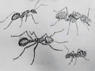
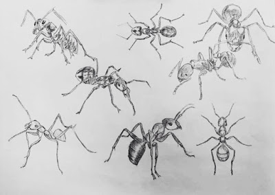
- Sketches
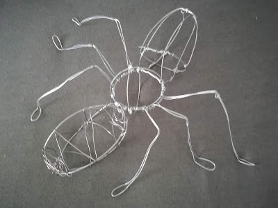
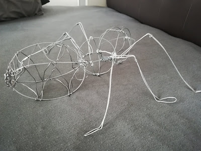
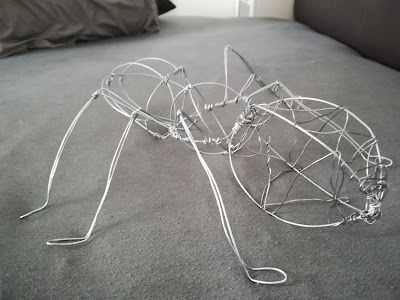
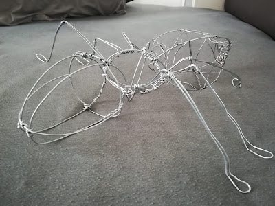
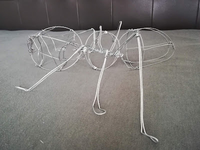
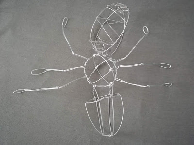
- 3D Wire Sculpture
2.2 Stylization
2.3 Simplification
2.4 Composition
3. Finding
3.1 Final Outcome
1.1 INTRODUCTION
Ants are eusocial insects of the family Formicidae and, along with the related wasps and bees, belong to the order Hymenoptera. Ants evolved from wasp-like ancestors in the Cretaceous period, about 140 million years ago, and diversified after the rise of flowering plants. More than 12,500 of an estimated total of 22,000 species have been classified. They are easily identified by their elbowed antennae and the distinctive node-like structure that forms their slender waists.
Ants form colonies that range in size from a few dozen predatory individuals living in small natural cavities to highly organised colonies that may occupy large territories and consist of millions of individuals. Larger colonies consist of various castes of sterile, wingless females, most of which are workers (ergates), as well as soldiers (dinergates) and other specialised groups. Nearly all ant colonies also have some fertile males called "drones" (aner) and one or more fertile females called "queens" (gynes). The colonies are described as superorganisms because the ants appear to operate as a unified entity, collectively working together to support the colony.
KEY IDEA
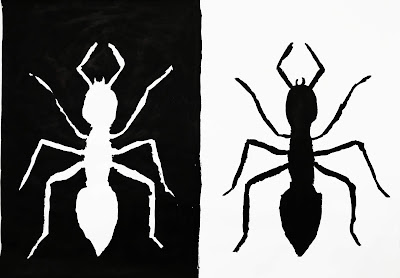
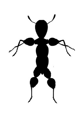
After a group discussion, we have decided to choose ants as our form and visual ordering. Ants are eusocial insects of the family Formicidae and, alongwith the related wasps and bees, belong to the order Hymenoptera. Ants are exoskeleton creature which has 3 pair of legs and a pair of antennae.
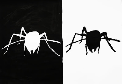
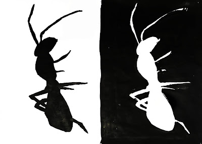
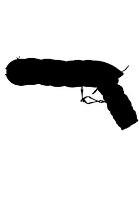
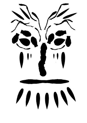
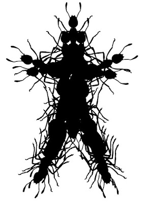
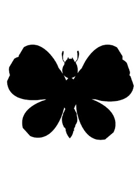
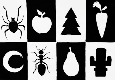
As in all insects, an ant's body is divided into three main parts: the head, the thorax,and the abdomen. The thorax is composed of three segments, each with a pair of legs. Since most of the ants have their own unique colors, it can be reference while doing stylization for the ant. We did a lot of research from the website while forming the different views of ant by using wire. The simplification of the views of the butterfly can form up into other object's shapes so we make use of it and do composition for it.
Afterwards, we gather ideas and take the composition outcome as reference, we planned out the form of the final outcome for this project.
FORM
Now that you can see how ants are put together and what each part is named, let’s learn what each part does and what is inside of them.
The ant’s second body segment, the mesosoma, is packed full with muscles that power its three pairs of legs. The legs are designed for running – ants can run very fast for their size. At the end of each leg is a hooked claw that is used to climb and hang on to things.
The head of an ant is similar in some ways to our own heads. It's the first segment on the ant, and it contains sensory organs. On our own heads, our sensory organs include eyes, ears, a nose and a mouth. An ant has eyes as well, but they are compound eyes. This means that instead of each eye having one lens like ours, it has many lenses attached.
An ant also has a mouth, with special mouthparts called mandibles. These parts are used for cutting, grabbing and biting.
2.1


2.2
3D Wire


Simplification


2.4 Composition


Process


3.1 Final Outcome







Comments
Post a Comment